Shaking Things Up, One Bottle at a Time
Mijenta Tequila
Mijenta Tequila is a premium, craft tequila brand that prides itself on quality, flavor, and the stories behind every bottle. They came to us seeking a full site revamp that would simplify their tech stack, elevate the customer experience, and let their beautiful branding and photography shine.
Before the Pour: The Challenge
Before working with us, Mijenta had a beautiful brand and photography, but their site wasn’t fully delivering the experience their customers deserved. The platform was cluttered with apps, navigation was confusing, and key product information wasn’t easy to find. We redesigned and rebuilt the site to optimize usability and highlight their premium brand. The result is a site that not only reflects Mijenta’s brand story but also performs for their customers.
Streamlining the Tech Stack
Mijenta wanted a more reliable setup. We migrated the site from Gempages to Shopify, removed unnecessary apps, and replaced their review system with Judge.me. We removed unnecessary apps, integrated reviews into PDPs and PLPs, and migrated age verification into a centralized system—simplifying their tech stack while keeping compliance and functionality intact. This migration has set the stage for smoother operations and improved UX.
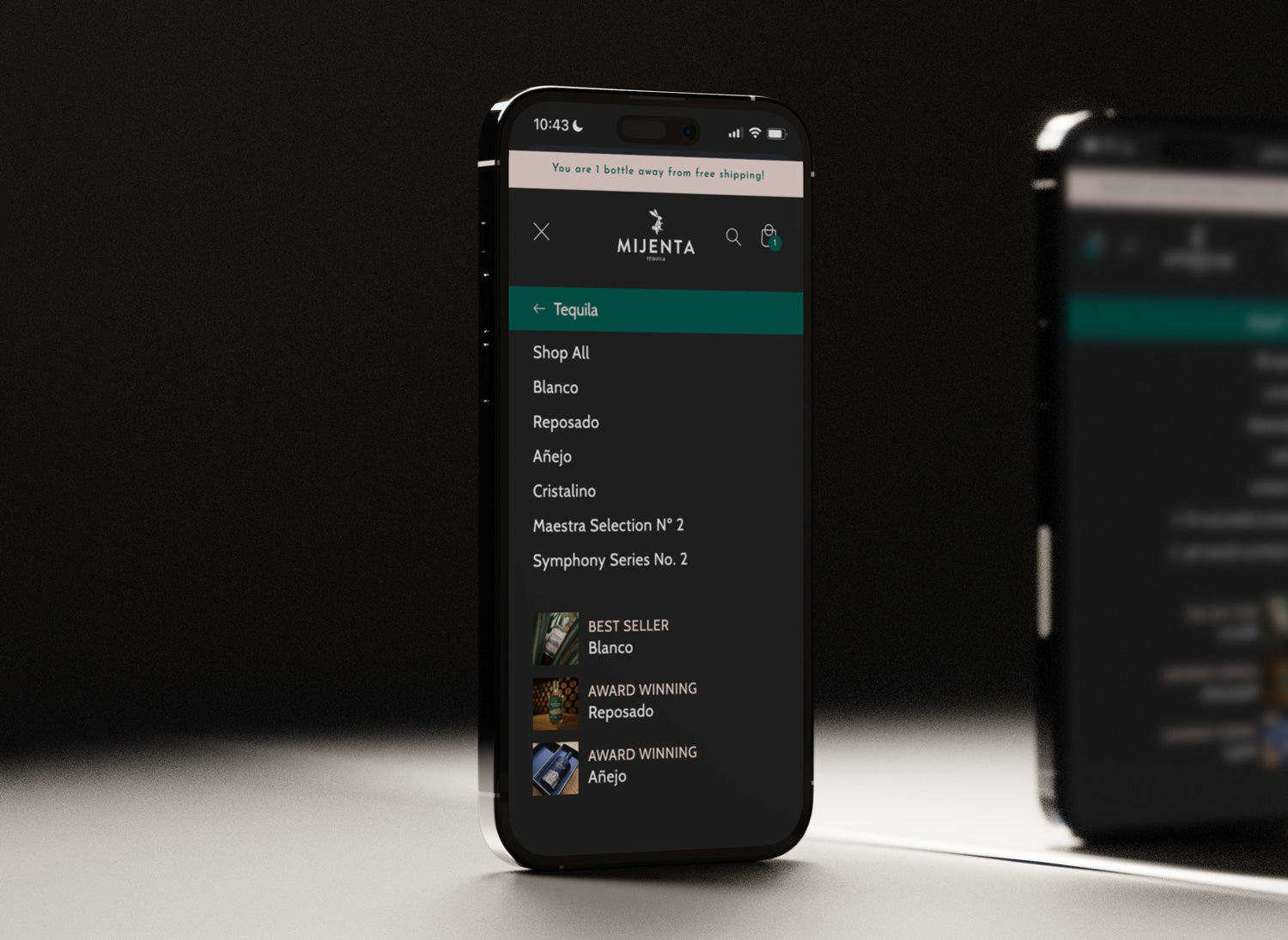
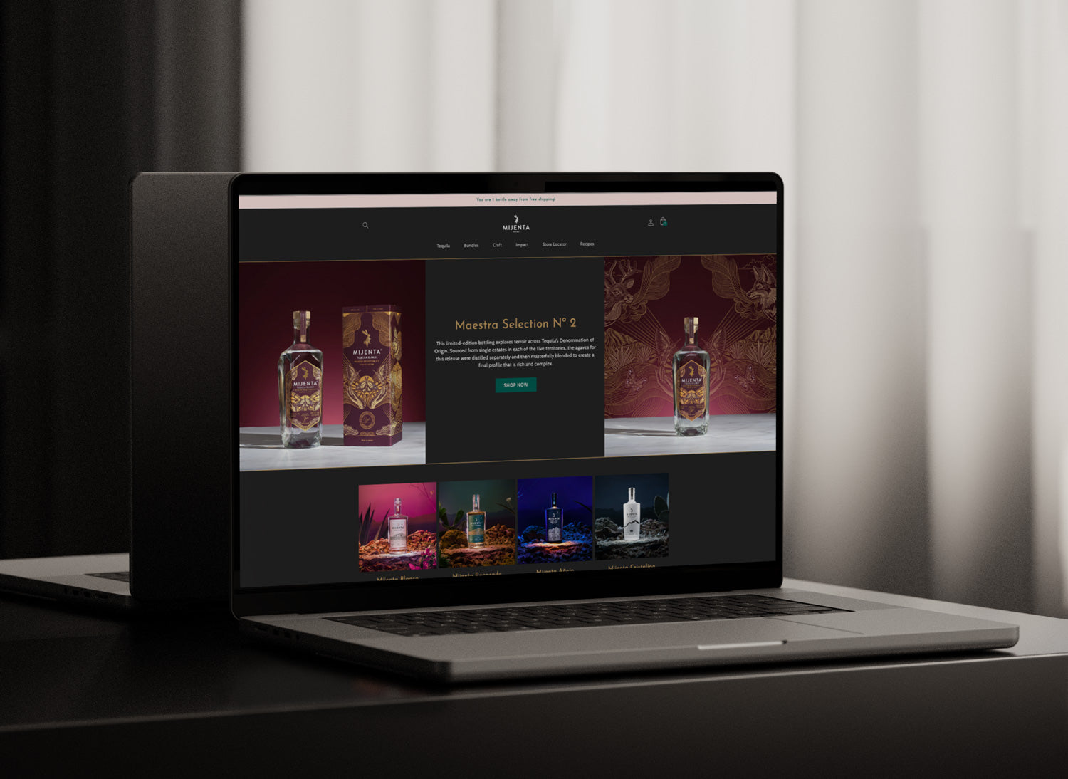
A Fresh, Intuitive Menu
We reorganized the site navigation to be intuitive for both desktop and mobile users. A custom mega menu highlights Mijenta’s stunning imagery and helps visitors find products quickly, improving the overall user experience across devices.
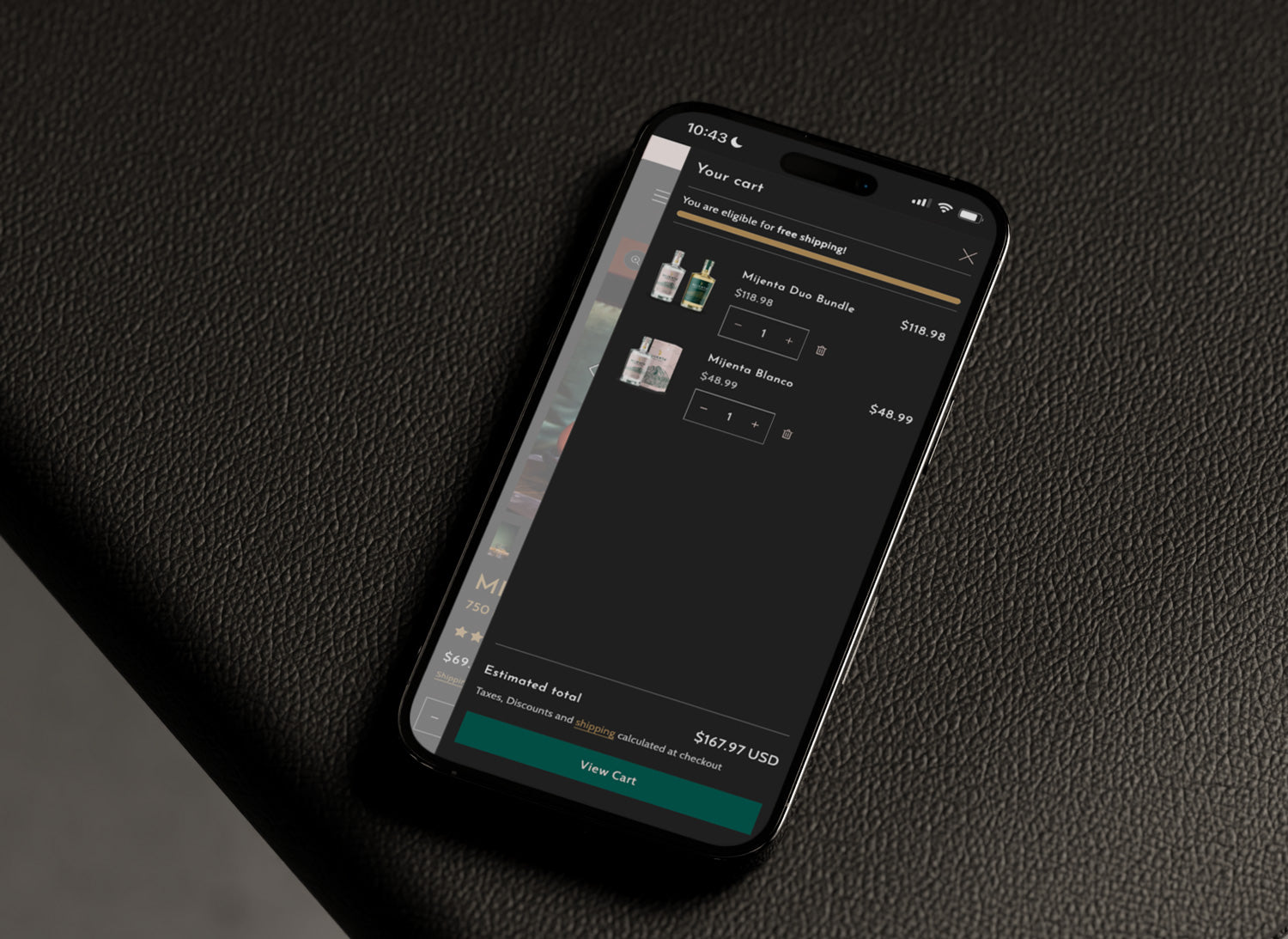
Cart Designed for Conversion
The cart was redesigned with both conversion and brand alignment in mind. A free shipping threshold encourages larger orders, and the overall experience feels on-brand while remaining frictionless and optimized for usability.
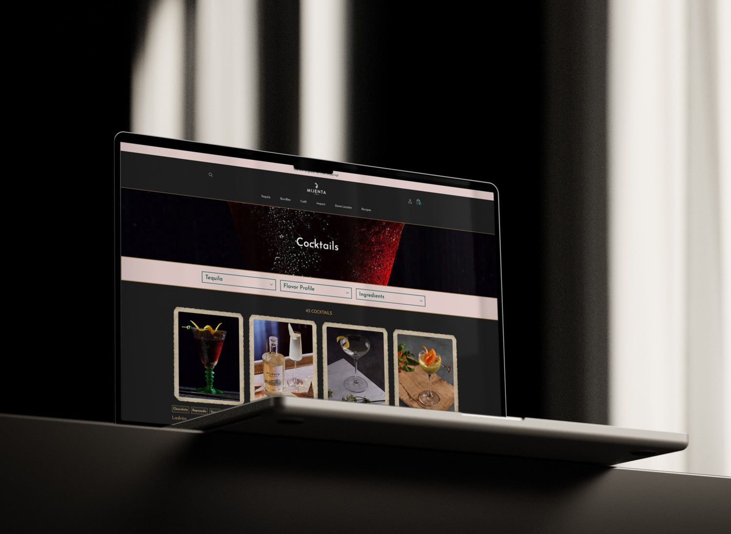
Custom Blog Functionality
A custom blog design allows Mijenta’s customers to easily browse cocktail recipes by tequila type, flavor profile, and available ingredients. This creates an engaging resource that keeps visitors exploring and returning.
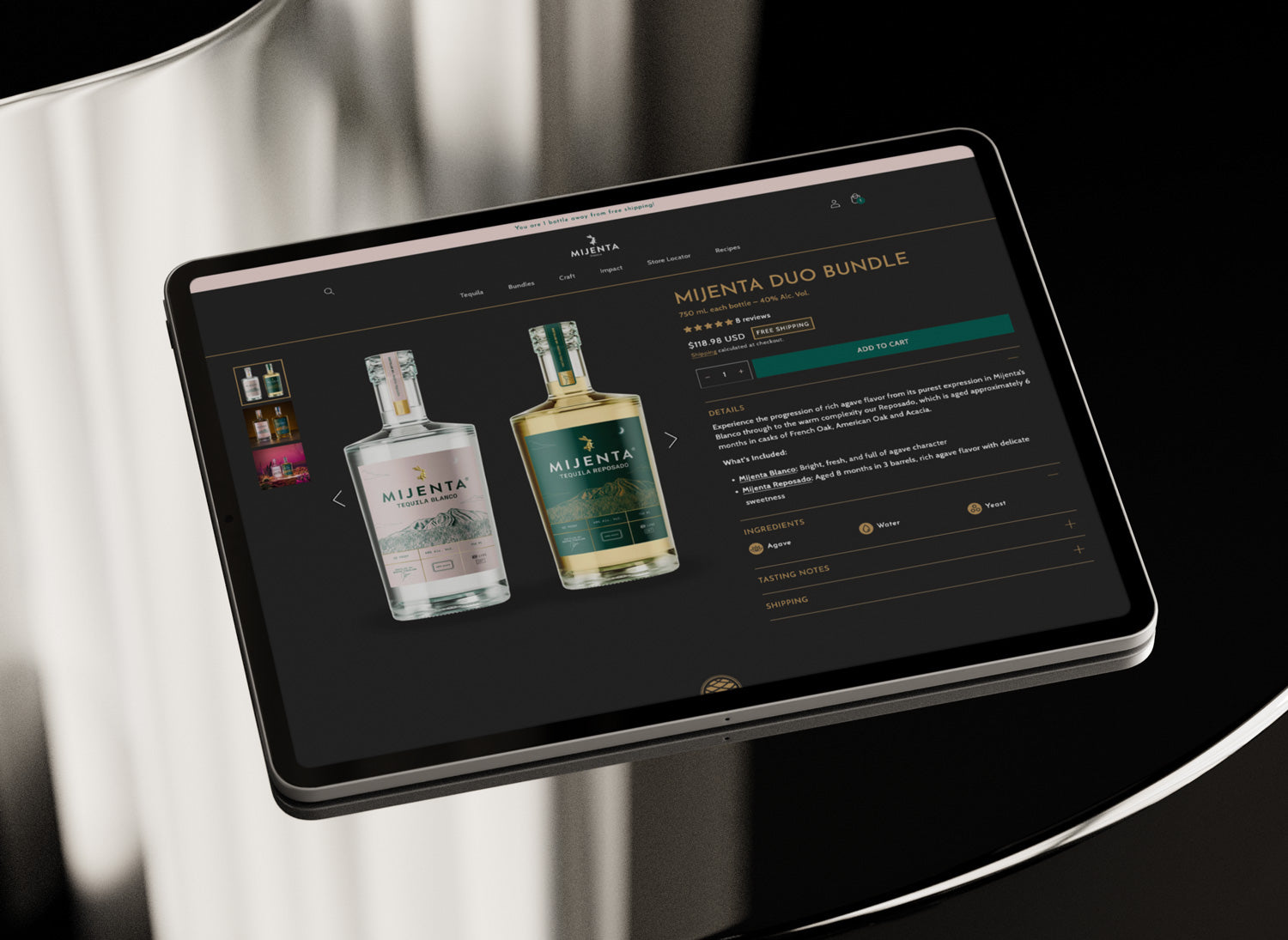
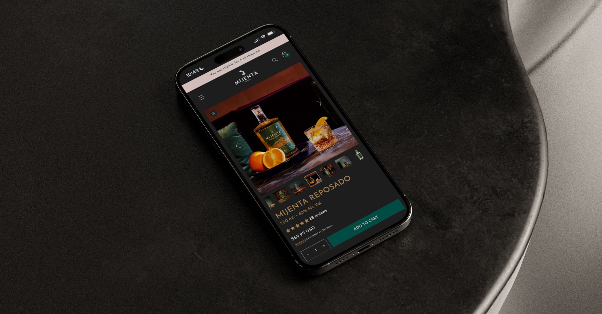
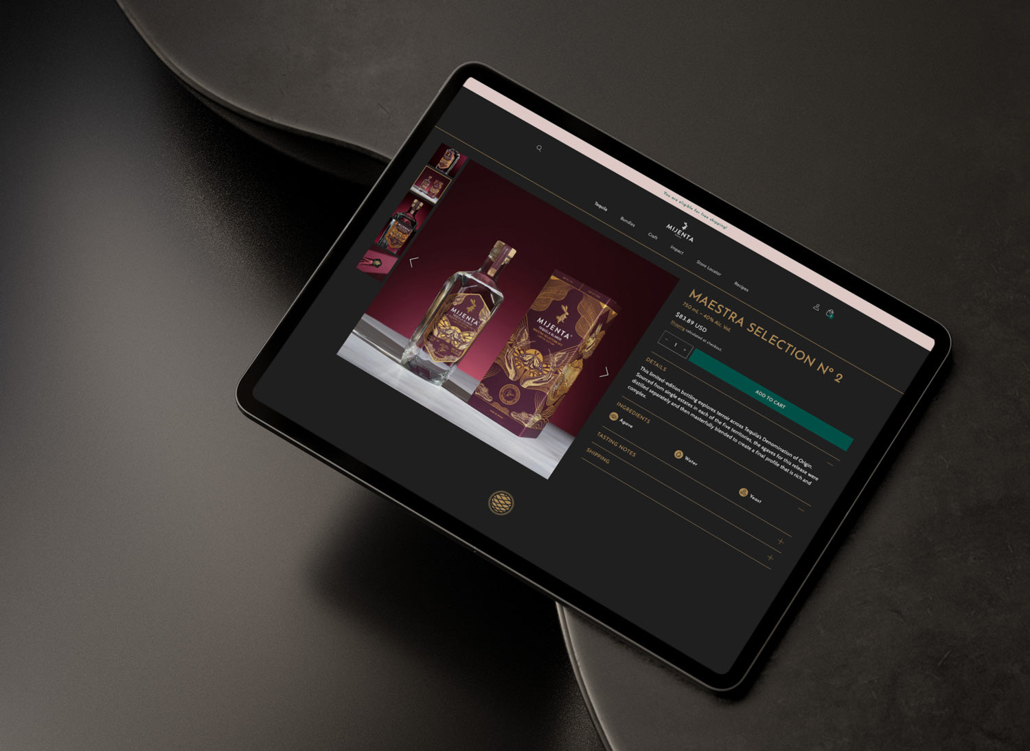
Product Detail Pages That Sell
The product pages were overhauled to showcase lifestyle photography, ingredients, tasting notes, and shipping information. We added a custom “Free Shipping” badge for orders over two bottles and redesigned bundle products to clearly show details for every included bottle. Mobile optimization was a priority for a smooth experience across devices.
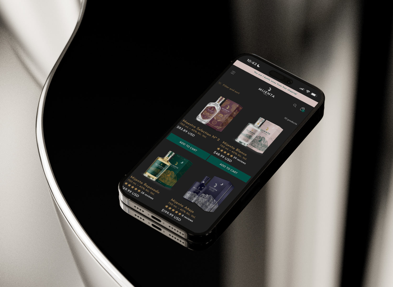
Optimized Product Listing Pages
Collection pages were revamped to include reviews, alcohol volume, and merchandising details so customers can shop efficiently without needing to click into every product page. Alcohol volume requirements were also enforced here to maintain compliance, working hand-in-hand with the product updates.
Being a Strategic Partner
Raising a Glass to Mijenta
Today, Mijenta has a modern, high-performing Shopify store that reflects their premium brand. With a streamlined foundation and enhanced UX, the team is ready to grow their direct-to-consumer strategy while continuing to delight customers with their products and story.
View the Site