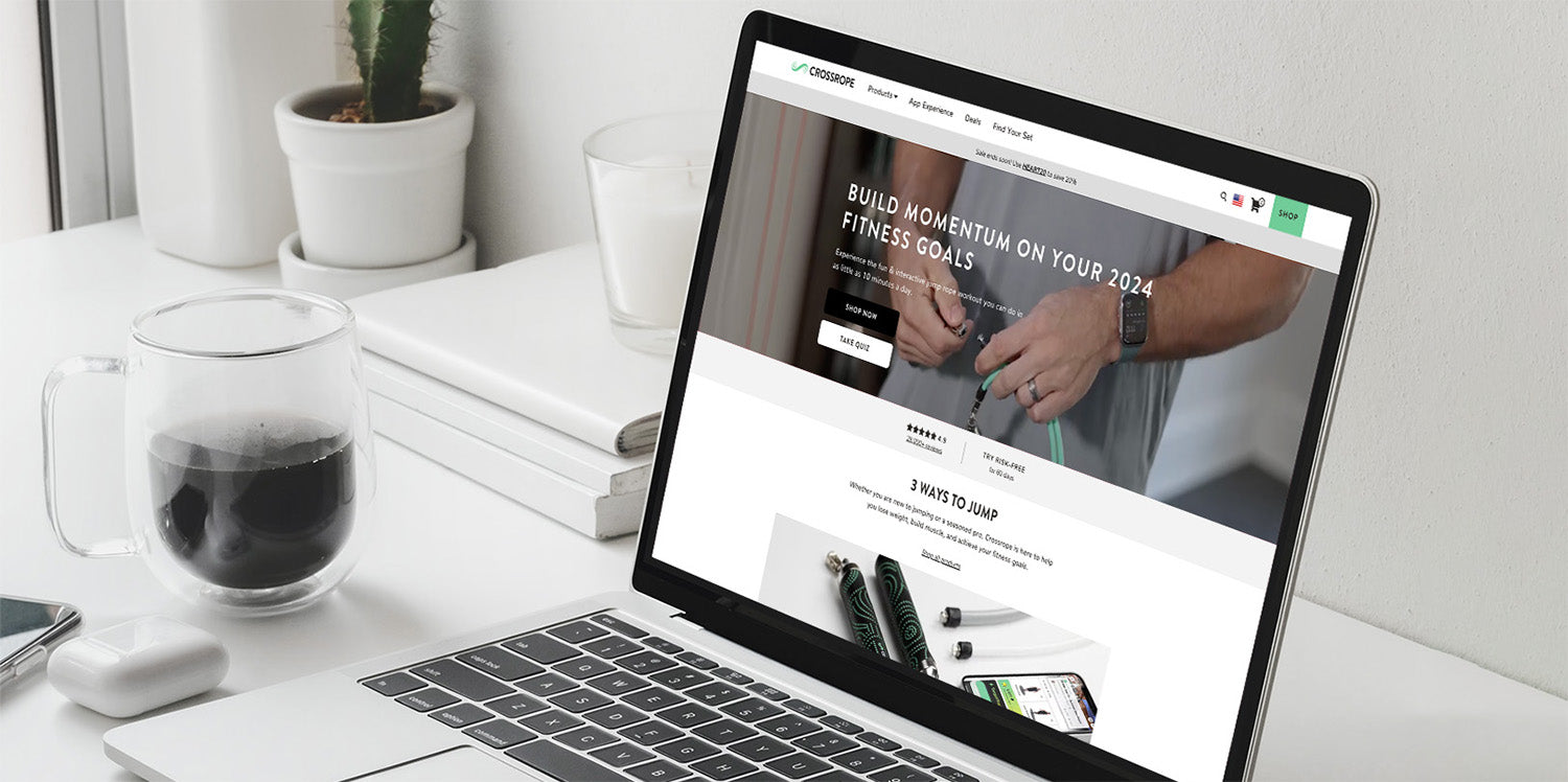
In today's eCommerce landscape, optimizing images is crucial for enhancing website performance and user experience. At Netalico, we understand the importance of delivering fast-loading, visually appealing online stores, which is why we've developed best practices for image optimization on platforms like Shopify, BigCommerce, and Magento.
Why Image Optimization Matters
Images are often the heaviest elements on a webpage, significantly impacting loading times. Slow load times can lead to higher bounce rates and lower conversions, negatively affecting your bottom line. Optimizing images ensures that your site loads quickly, provides a better user experience, and ranks higher in search engine results.

Best Practices for Image Optimization
-
Choose the Right Format
- JPEG is ideal for photographs and images with many colors.
- PNG is best for images with transparent backgrounds or text overlays.
- WebP is a newer format that offers superior compression and quality but may require fallback options for older browsers.
-
Compress Images Without Sacrificing Quality
Use tools like TinyPNG or ImageOptim to reduce file sizes while maintaining image quality. Shopify, BigCommerce, and Magento support various plugins and extensions that can automate this process.
-
Resize Images Appropriately
Ensure your images are not larger than necessary. For example, if your theme displays product images at 800x800 pixels, uploading a 2000x2000 pixel image only slows down your site. Most eCommerce platforms allow you to set default image dimensions, so utilize these settings to streamline the process.
-
Implement Lazy Loading
Lazy loading defers the loading of images until they are needed. This technique is particularly useful for pages with many images, as it reduces initial load time. Shopify, BigCommerce, and Magento all support lazy loading, either natively or through third-party apps and extensions.
-
Optimize Image Alt Text
Alt text is essential for SEO and accessibility. Use descriptive, keyword-rich alt text for your images to improve search engine visibility and help users with visual impairments understand your content.
Platform-Specific Considerations
Shopify
Shopify offers built-in image optimization features, including automatic image compression and the use of a Content Delivery Network (CDN) to speed up image delivery. Shopify also supports WebP, providing even faster load times for supported browsers.
BigCommerce
BigCommerce users can take advantage of the Akamai Image Manager, which automatically compresses and optimizes images. The platform also supports WebP and lazy loading, making it easy to improve site performance.
Magento
Magento provides various extensions for image optimization, including those that offer automatic compression and resizing. Magento's flexibility allows for custom solutions, such as implementing a CDN for faster image delivery.
Video Optimization for Shopify: Finding the Right Balance
Conclusion
Optimizing images and video is a critical aspect of managing a successful eCommerce store, regardless of the platform. At Netalico, we've seen firsthand how these practices can significantly enhance website performance and user experience. Whether you're on Shopify, BigCommerce, or Magento, implementing these strategies will help you deliver a faster, more efficient online shopping experience for your customers.
For more personalized advice or assistance with your eCommerce platform, don't hesitate to contact us at Netalico. We're here to help you optimize every aspect of your online store!